
Brand guidelines
The Collabaway brand
Our logo, colours, type and voice, and how to use them. For partners, press and anyone building with us.
The logo
A frame around the c
The blue corner is the brand. The magenta corner is the creator. Between them sits the c of collabaway, the same letter as in the wordmark: Collabaway in the middle, holding the deal together. The open sides say the deal is open and two-way: nobody is boxed in.
The full logo is the mark and the word "collabaway" in lower case. Use the full logo wherever there is room.
Versions
Pick the version for the background. On dark, both corners lighten and the c turns white, so everything keeps its contrast.
Colour on light. The default, on white or paper.
Colour on dark. Navy or black backgrounds.
White. On brand blue, the gradient and photos.
Navy, one colour. Print in one ink, stamps, documents.
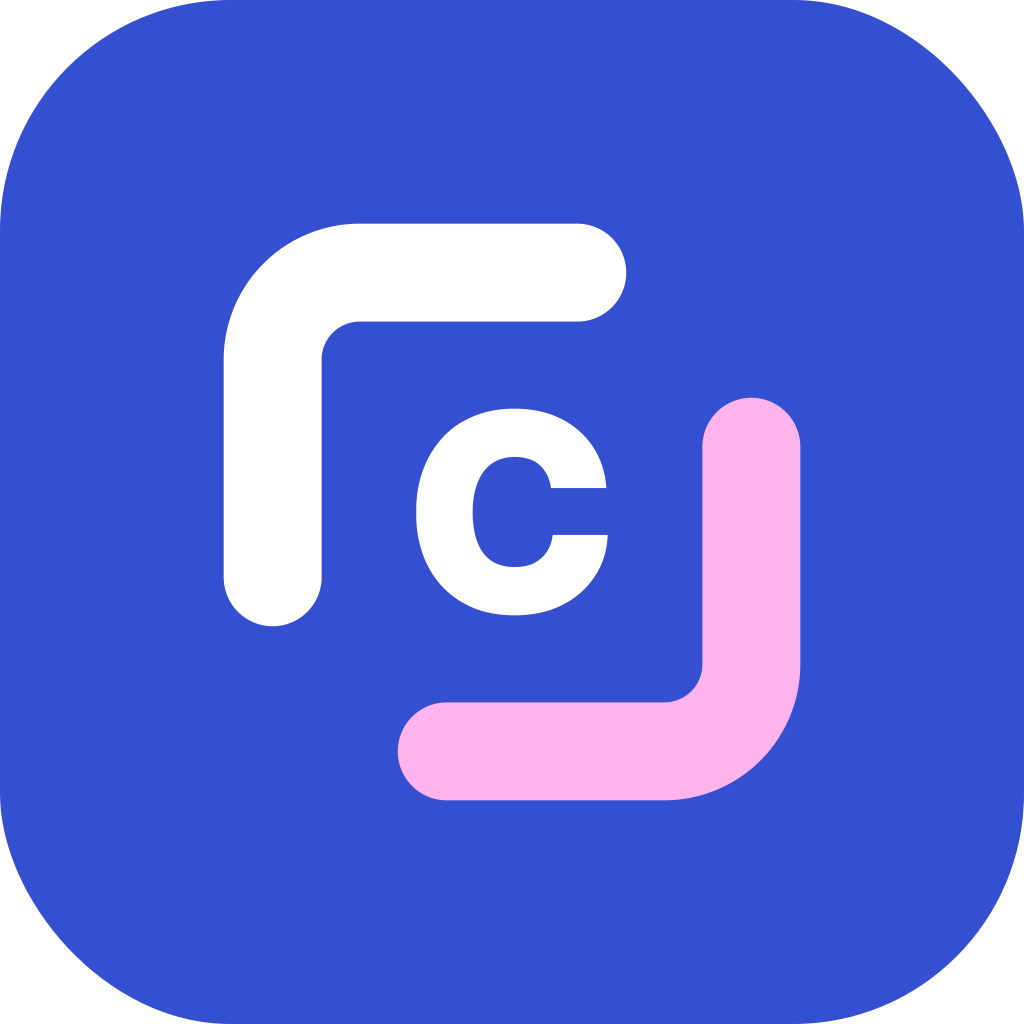
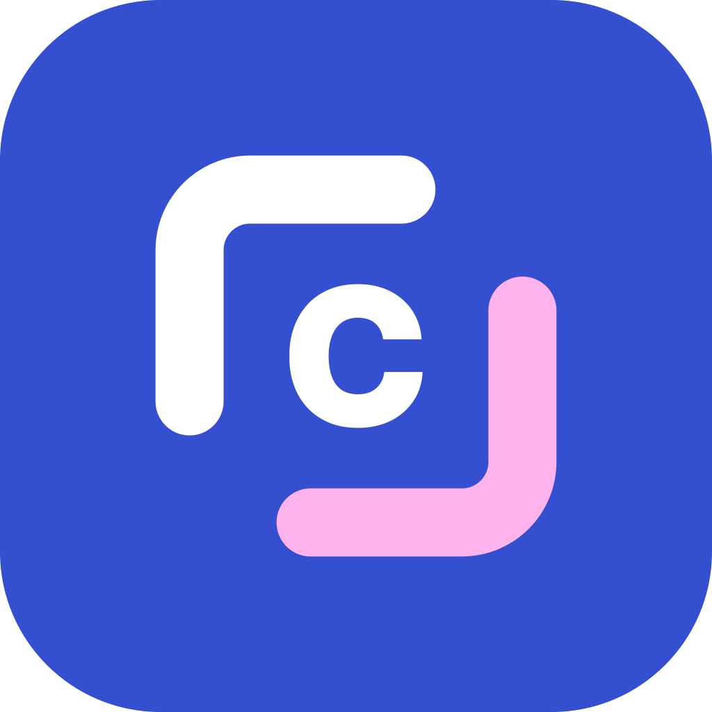
App icon. White mark and c on brand blue, the magenta corner softened to pink.
Profile picture. The mark alone, centred, with room around it.

Favicon. The frame alone in its colours, on a white rounded tile so it reads on dark tabs too. The c is left out: at 16 px it can't be read. Never the wordmark.
Clear space and size
- Keep clear space of half the mark's height on every side.
- The full logo is at least 96 px wide on screen, 25 mm in print.
- The mark alone is at least 16 px.
- In the website header: mark 30 px, wordmark 22 px, on the left.
- Next to another company's logo, match their logo's height and keep the clear space between them.
Don'ts
Don't stretch or squash it
Don't rotate it
Don't add shadows or effects
Don't swap or change the colours
Don't put the colour logo on busy photos
- Collabaway.com
Don't add .com or change the lettering
Colour
Blue leads. Magenta and cyan are accents: use them for one highlight at a time, not as backgrounds for body text.
- Brand blue
#354FD1 · RGB 53 79 209
The main colour: buttons, links, the brand corner of the logo. White text on it passes at any size (6.6:1).
- Creator magenta
#EF21B6 · RGB 239 33 182
The creator corner and highlights. White text on it only for large text (3.8:1).
- Cyan
#02AAF5 · RGB 2 170 245
Secondary accent: brush strokes, tags, illustrations. Use navy text on it, never white.
- Navy
#17212D · RGB 23 33 45
Text, the wordmark, dark surfaces such as the footer and sidebar.
- Paper
#F3F5FD · RGB 243 245 253
The page background behind sections and cards.
- Line
#DDE2F2 · RGB 221 226 242
Borders and dividers.
On dark backgrounds, use these lighter versions for the logo and highlights.
Brand gradient, blue to violet to magenta. Only for large calls to action and app icons, with white text.
Type
Sora, Bold and Semibold
Aa Bb 123
Headings and the wordmark. Tight tracking (-2%), sentence case, short lines.
DM Sans, Regular, Medium and Semibold
Aa Bb 123
Body text, buttons and the app. Body at 16 to 18 px, line height 1.5. Both fonts are free on Google Fonts.
Page title, 40 to 60 px
Section heading, 28 to 40 px
Card title, 18 to 22 px
Body text, 16 to 18 px, in navy or muted grey #5B6474.
Shapes and imagery

Brush strokes
Under one key phrase in a heading, never more than one per heading. Cyan or magenta.

Circle and tile
The pink circle and cyan tile sit behind photos, partly hidden. Decoration only.

Photography
Real people making things, natural light. Stock photos never get names or numbers; product screenshots are labelled sample data.
Tagline
Collab all the way.
From first offer to final invoice, for creators, brands and agencies.
Why it works: it plays on the name (collab-a-way) and says what we do: a deal carried all the way through, from the first offer to the final invoice, with the brand, the agency and the creator on it together.
- Write it exactly: “Collab all the way.” with the full stop
- On dark, “all the way.” can take the on-dark magenta; on light, keep it one colour
- Pair it with the line underneath when people don’t know us yet
- Never translate the pun word by word; write a new line instead
Voice
We write
- Plain words and short sentences
- To “you”, about creators, brands and agencies
- What the product does today
- “Switched on in stages” for things not live everywhere
- Numbers only when they are real, with their source
We don't write
- Hype: revolutionary, game-changing, seamless
- Long dashes in copy (use a full stop or a comma)
- “Beta” labels in the product
- Made-up stats, logos or testimonials
- Promises about features that aren’t switched on
Downloads
Vector files (SVG) scale to any size. Use PNG only where SVG isn't accepted.
Download everything (ZIP)Full logo






Mark and icon


Using the logo for a partnership, press or an event? Follow this page, and tell us if you need something it doesn't cover.
Social media kit
Ready to upload at each platform's recommended size. Profile pictures are cropped to a circle on most platforms, so the mark sits well inside it. LinkedIn company pages show the logo square: use the dark square one there.
LinkedIn profile banner · 1584 × 396. Text sits right; your profile picture covers the bottom left.
PNGLinkedIn company page cover · 1128 × 191. Short format, no subline.
PNGX (Twitter) header · 1500 × 500. Text sits right of the profile picture.
PNGYouTube channel banner · 2560 × 1440. Everything important is inside the centre 1546 × 423 area every device shows.
PNGFacebook page cover · 1640 × 624. Centred, so phone crops keep the text.
PNG